Case Study: Card Anatomy Framework for Requisition Item Selection
I created a Card Anatomy Framework to test whether standardizing information hierarchy could reduce cognitive load across inconsistent, data-heavy interfaces.
The problem wasn’t a single UI issue—it was that different teams were solving similar problems in different ways, leading to fragmentation. My hypothesis was that a consistent structural approach to how information, actions, and states are organized would improve usability more than isolated UI improvements.
Instead of designing a single feature, I built a flexible framework and applied it across multiple scenarios to see how it held up under different conditions. I used this as a lightweight prototype to test how users interpreted and interacted with structured vs. unstructured layouts.
What I learned was that consistency at the structural level significantly improved scanability and decision-making—but also that rigid standardization broke down in edge cases. That forced me to rethink the framework as something adaptable rather than fixed.
The biggest takeaway was that designing systems isn’t about enforcing consistency—it’s about creating structures that can flex without losing clarity.
OverviewDesigned a reusable card anatomy framework that improves scanability and reduces decision errors when adding items to requisitions.
Quick facts (chips or bullets):
Role: UX Design (systems + interaction)
Product area: Purchasing / Requisitions
Outputs: Card hierarchy model, tier rules, icon/token guidance, Jira-ready criteria
Impact focus: Faster decisions, fewer mistakes, consistent UI across teams
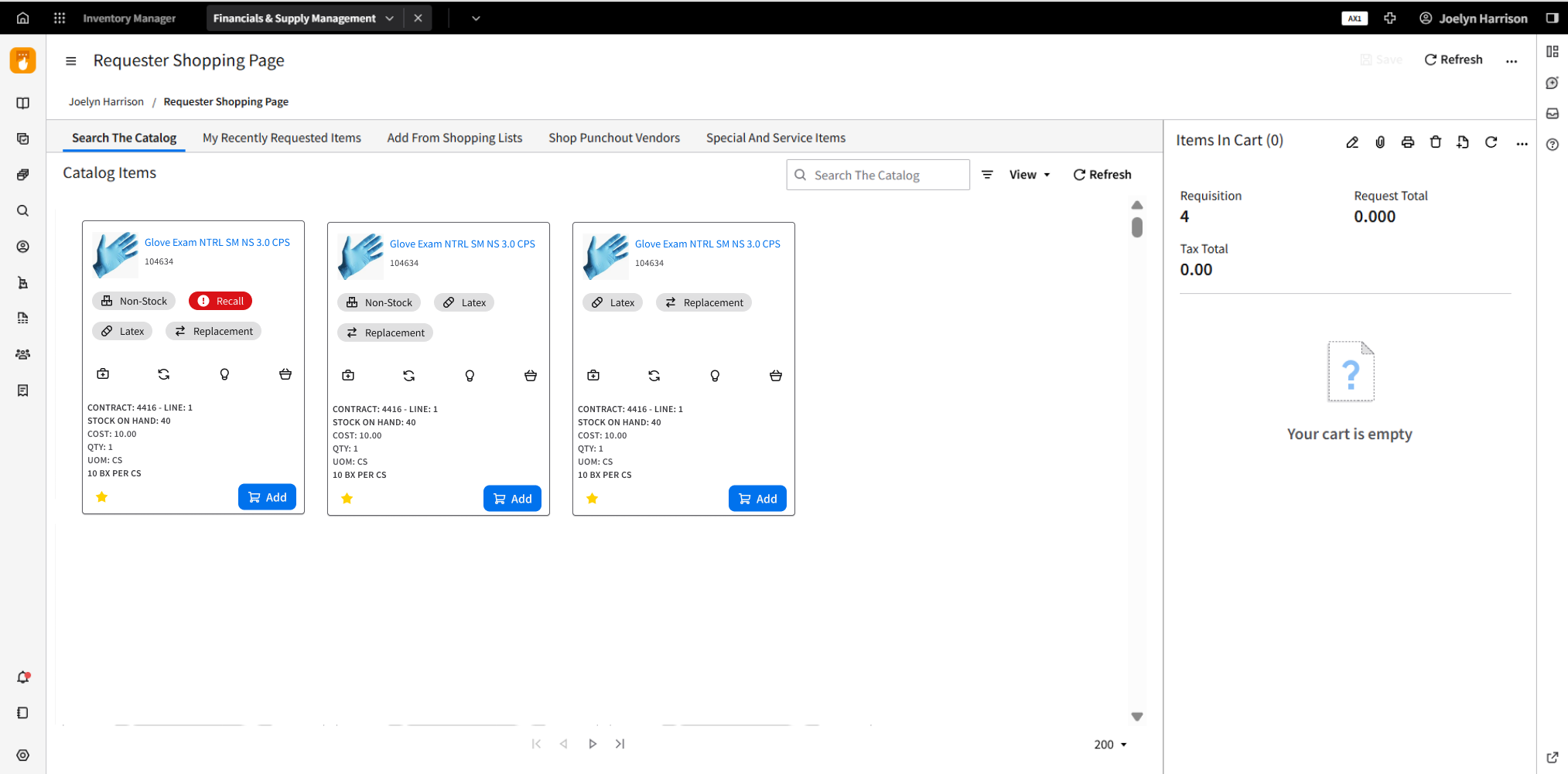
ProblemBefore: The requisition “add item” card tried to show too much at once. Critical flags (like recall) competed with secondary info (like kit/subs metadata), making it harder to scan and increasing risk of adding the wrong item.
Design challenge:
How might we display decision-critical item signals instantly, while keeping helpful context discoverable—without making the card feel dense or noisy?
GoalsMake “can/should I add this item?” answerable in 1–2 seconds
Separate critical vs contextual vs operational info
Create rules that scale across many item types (stock, non-stock, recall, etc.)
Keep accessibility intact (icons + labels, not icons-only)
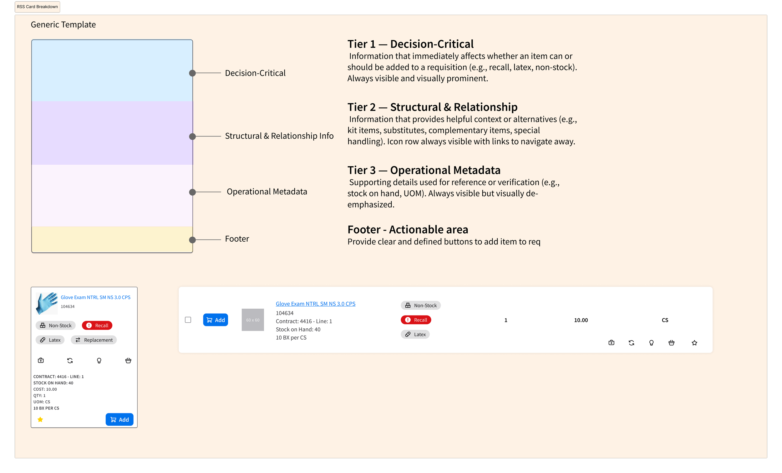
Approach: Tiered Information ArchitectureTier 1 — Decision-Critical (Always Visible)
Signals that change whether an item can/should be added (e.g., Recall, Latex, Replacement, Non-Stock).
Rule: If it changes whether I can order it → Tier 1.
Tier 2 — Structural & Relationship Info (Collapsed by Default)
Context that’s helpful but not blocking (e.g., Kit, Substitutes, Complementary, Special handling).
Shown as a single “Item Details” row with counts/links.
Tier 3 — Operational Metadata (Low Emphasis)
Reference/verification details (e.g., Stock on hand, UOM, contract/line info).
Visible but visually quiet.
Footer — Actions
Clear primary action (e.g., Add to Requisition) with predictable placement.

Rules & Governance Visual hierarchy rules created to protect consistency:
Never show more than 4 Tier-1 chips
Never mix Tier-1 and Tier-2 visually
Tier-2 content must be collapsible / link-based
Red reserved for Recall
Icons must remain understandable with text labels
What I Delivered (Concrete outputs)Card anatomy checklist for consistent builds
Tier model (what belongs where + why)
Icon + token mapping and visibility rules
Jira-ready acceptance criteria (implementation-ready)